When designing slides, it can be tricky to find a balance between expressing creativity and avoiding distractions. Here Is a compilation of our favorite tips for putting together good lyric slides in Presenter!
Choosing a Font
A good font is one of the key ingredients of a good lyric slide. You want a font that is clean and classic rather than too creative or distracting for the people reading along. We recommend going for Sans Serif fonts such as Tahoma, Gill Sans, or Open Sans. You can also check out CMG Sans, a free font from Church Motion Graphics specifically designed for church lyric slides.
Font Color
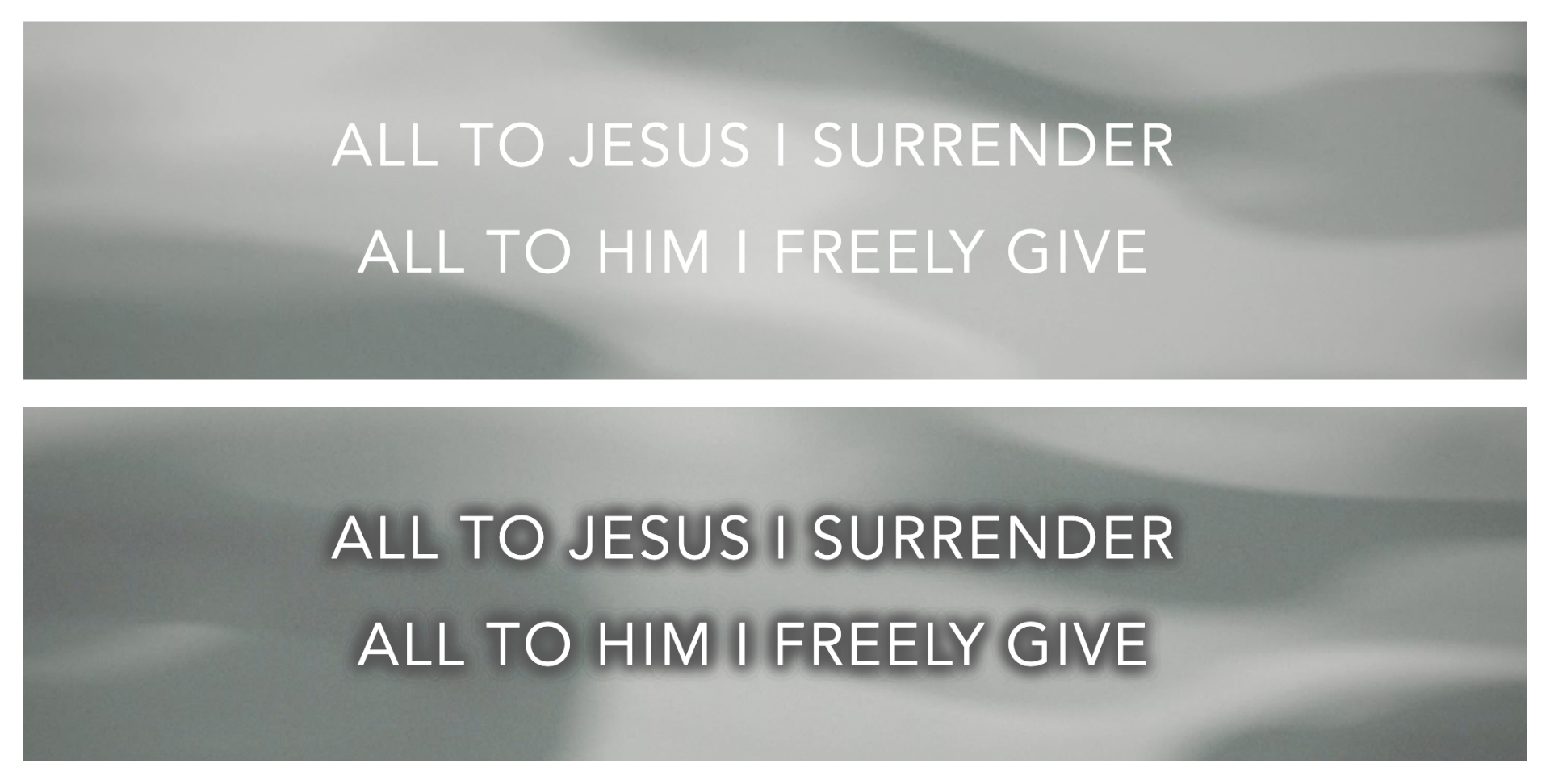
The color of your text should always contrast with the selected background. You may also want to consider adding a subtle shadow or outline around the text to make it pop out more. In the image below, see how the shading around the letters creates more contrast against the grey motion background.
In Presenter, you can easily add a shadow and/or outline to your text. Simply go to your lyrics template editor and adjust these settings to your liking. You can also play around with the "Advanced" settings to adjust things like the spacing between your letters and lines.
Lines per Slide
Two lines per slide is a good standard to aim for, although, you may also have slides with one line or three lines depending on the song. Song section breaks typically occur every four lines (ex. choruses are usually about four or eight lines long), which is why many churches like the four-line format. However, having fewer words on each slide improves the audience's reading experience. Your slides person will have more slides to click through, though!
Lastly, make sure your font design choices are consistent throughout your slides.
Selecting a Background
When choosing a background, avoid options that are distracting or busy. You also want to select an option that fits the overall mood of the song.
By default, Presenter sets a black background to your slides. White text on a dark background, as opposed to dark text on a lighter background, makes for the most optimal viewing experience as it creates less light pollution and is softer on the eyes.
If you're looking for some variety, you can upload your own images to your Media Library. Again, just make sure that your text stands out against your chosen background.
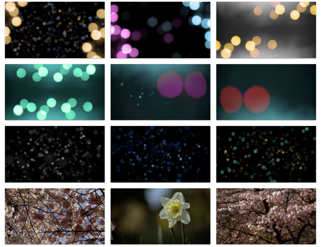
Motion Backgrounds
With motion graphics, lean towards options with subtle movements and ones where the motion is seamless when looped - you don't want a noticeable break when the graphic loops back to the beginning.
WorshipTools provides three different tiers - Free, Pro, and Pro Plus. With the Free and Pro accounts, you get access to a free motion graphic and slide template each month. With a Pro Plus account, you have unlimited access to all the graphics and templates in our library. You can also find other options from the Internet to upload to your Media.